I just thought I would share all of these with the class, I did some of these last year for my Ap portfolio, I hope you like!
Friday, October 29, 2010
Wednesday, October 27, 2010
Strobist Kit- tali
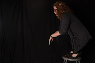
These are really bright, and although my body blends in with the background I like the affect is portrayed in the photograph. I still need to work on to balance the light and the white in order to get a better balanced photo. I definitely don't have any shadows in my photos and I like/don't like that effect.
*
Here is one photo that is not as bright as the other photos:
Tali Lekorenos
Sunday, October 24, 2010
Strobist Kit
I really liked doing portraits with the Strobist kit. I could control every aspect of the lighting, and get shots done just as I planned. I got this particular shot with each flash pointed opposite the subject, each with an umbrella reflecting the light back.
-Roger Wieand
strobist kit
Although it took me a few tries to understand how to use the kit, I really liked the effect it gave to even the most simple things. For this shot I put a single flash to the right of the shoes at an angle to get the shadow I wanted.
-Belkis
Friday, October 22, 2010
Strobist Kit
The strobist kit was so much fun to work with.
I ended up dragging my roommate and my friend down to the lighting studio with me and we had so much fun. It took a while but the concept I originally wanted came out in the first shot.
The second shot is my friend Kassandra. This also, I thought, turned out pretty good.
-Eliza
Strobist Kit
I used a single flash for this picture, set to the left of and slightly below the vulture.
I played around with a lot of different versions of this shot; I was never quite able to get the effect that I wanted, but I think this version comes the closest to what I was hoping for. I aimed the right-hand flash through a white umbrella to soften the glare on the underside of the stairs, but kept the left-hand flash unfiltered -- I liked the lines that the succession of brighter glares reflecting off the various rails created.
-- Kate
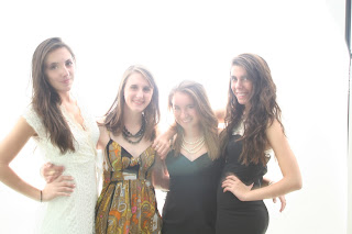
I know that these look like they are really bright, and I did these wrong, but I really like the light coming from behind, and it was my choice to do it this way. The two that are darker, are examples of when the strobist light didn't actually go off, but i really like them, in a weird artistic way. Its really interesting to see that the white dress didn't really work with the light, and the black colors really stood out! This was really fun to play with!
-Emily Schreiber
Thursday, October 21, 2010
Strobist Kit "Bookworm"
For this shot I used a blue gel and put it inside of a book. I set the flash to about 1/16 and over exposed the picture so that the flash would have a creepy effect.
-Ashlee Dickson
-Ashlee Dickson
Strobist Kit
Sorry the quality is so bad... It was the only way I could make the size of the picture smaller so the blog site would be able to upload it without too much trouble
-Wilson
Wednesday, October 20, 2010
Strobist Assignment
I went into this project knowing nothing about the strobist kit and unsure of what I wanted except that I wanted to have fun with it, so I invited a bunch of my friends to come for a few hours of picture-taking and I told them to bring whatever props they wanted to play around with. I ended up with a whole bunch of pictures that I really loved, but in the interest of space I am only including a few below.
The picture above was taken with the flash to the left of the photo, with a low-powered diffused fill light (1/32) coming from the right. I love the slightly dark tone of the picture, as well as the shadow behind her.
This second picture was taken outside at night, and it took me a while to get it the way I wanted it. The flashbulbs are positioned behind the two subjects, and the umbrella diffuses the light just enough to get the effect I wanted. I found that simply putting the umbrella on the flash stand illuminated more of the ground behind the subjects than the subjects themselves, but was really happy with this particular effect. It's tough to get the full effect in the small version on the blog, but zooming in might help.
~Jessica Mazur
Wednesday, October 13, 2010
Thursday, October 7, 2010
Studium and Punctum
This provocative piece by Angela Strassheim, a former forensic photographer, serves as an excellent example of studium. The image is instantly evocative of Botticelli's The Birth of Venus, a cultural standard, but the industrial, consumerist atmosphere twists the classic theme into a biting social commentary.
Melanie Einzig's photo from 9/11 displays a remarkable use of punctum. The angrily smoking twin towers are a part of our cultural lexicon; a heartbreaking image, but one that immediately frames the photo (this element is likely more studium than punctum.) But our eyes soon dart to the UPS delivery man, who makes for a headspinning punctum. What could possibly be more mundane than a package being delivered? But its mundanity serves a purpose – it conjures up personal experiences, however average, which communicate just how shocking those events were. This recontexualization results in perhaps the finest image of that day.
-Roger Wieand
Monday, October 4, 2010
Studium and Punctum
I really liked Sally Mann's photos, and found one to use as an example for "punctum." I found a photo with similar subjects also in black and white to use for a "studium" example.

Since Sally Mann frequently photographed her daughters in black and white, I thought this photo would be a good example of my interpretation of "studium." It's a cute photo of three little girls, and probably has more meaning to whoever took the photo or knows the girls. While it's sweet, it does not strike you like "punctum" should.
-Paige Skuse
Subscribe to:
Comments (Atom)


