Tuesday, November 30, 2010
Panorama and Photo Align
This first picture is my panorama example, which I blended from three images.
The second picture is my photo-align experiment, also blended from three images.
(I don't know if this is just a product of the particular photos I used to make my panorama experiment vs. the ones I used while playing around with photo-align, but the image I made with the photo-align tool looks a lot closer to my idea of what panorama shots usually look like than the actual panorama image does. I was a little surprised by that.)
-- Kate
Monday, November 29, 2010
Issues with Panorama
Ok, so i tried tons of times to do a panorama, but it wasn't working out for me.....so instead of aligning, I did blending. This is four different photos. I used the film-light-viewing thing in the room off of the intro ot photo room.
i know its not panorama, but it is something :)
Miaja
photomerge
This is a combination of two images I took last fall in Interlaken, Switzerland while paragliding.
This is the image after cropping.
-Paige Skuse
This is the image after cropping.
-Paige Skuse
Panorama
Sunday, November 28, 2010
Panorama
This picture is a combination of four photos.
This second picture is a combination of two photos using the align photo function and playing with the opacities. It didn't come out the way I wanted it to, with the set of wooden animals doubled, but I really liked the surreal feeling of this particular combination.
~Jessica
This second picture is a combination of two photos using the align photo function and playing with the opacities. It didn't come out the way I wanted it to, with the set of wooden animals doubled, but I really liked the surreal feeling of this particular combination.
~Jessica
Monday, November 8, 2010
So additional Strobist Kit FUN
So these images were actually going to be for my narrative project. But I choose the female instead.
Chelsea A.
Sunday, November 7, 2010
Ad recreation
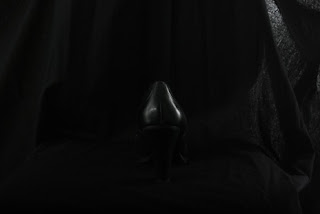
While the point of the original advertisement is to sell the phone, I wound up focusing on trying to recreate the lighting of the shoe, since I thought it offered a more interesting challenge. I was never quite able to get the lighting the way I wanted it to be; I always wound up being able to get either the brighter outlining of the upper edges or the softer, dimmer, but still clear lighting along the lower parts, but never the right balance between the two. This was one of the closer approximations, although the lower-shoe lighting is harder to see in this small version of the photo.
I worked mostly with reflected light, but I only reflected each light source off of one surface. If I ever try to create a shot like this again, I think I'll play around with bouncing the already-reflected light off of a second surface -- maybe something like that would have given me the softer lighting I needed along the bottom of the shoe.
-- Kate
Saturday, November 6, 2010
advertisement recreation
this is the advertising for some cosmetics, photographed by Man Chen, a Chinese fashion photographer.
i chose the one that imitate the light the best. other pictures i took have a clear sense that there are two light sources. I realize the original picture only has one major source.
------------------kaini
Friday, November 5, 2010
Advertisement recreation
I don't think the second picture really matches the ad but I thought it was cute so I posted it :P
Also the first ad has a much warmer and light than mine does. The light in my recreation is very harsh. I still have a lot of practice and experimenting to do in the lighting studio to achieve better lighting.
-Ashlee
Thursday, November 4, 2010
Advertisement
American Apparel advertisement.
Pretty simple, but trying to repeat the lighting in these ads (I tried a bunch of different kinds) was a challenge for me.
Thanks.
Eliza.
Wednesday, November 3, 2010
Tuesday, November 2, 2010
Subscribe to:
Comments (Atom)


